Hey hey all! How are ya? I’m back with the second part of the home-a-rama tour I visited last week. I showed you the first two homes (including my favorite) last Friday, and today I have three more. Sit down with some coffee cause there are a TON of photos!
The third house was the most modern design of all of them and I actually quite liked it. It is a beautiful home:
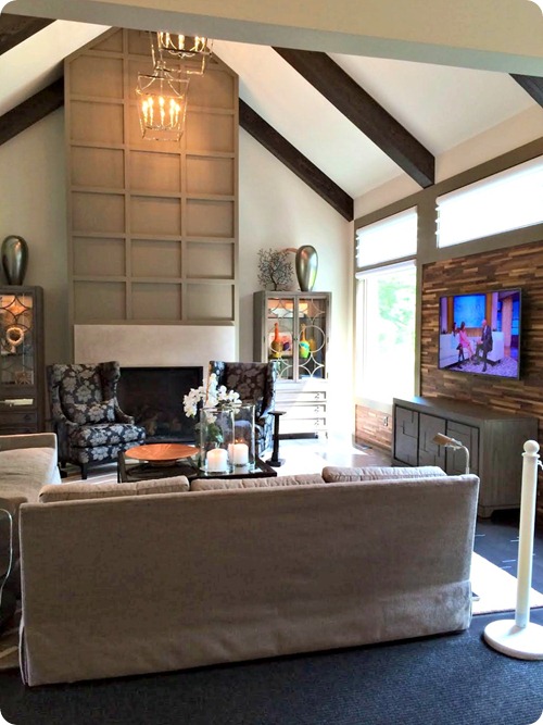
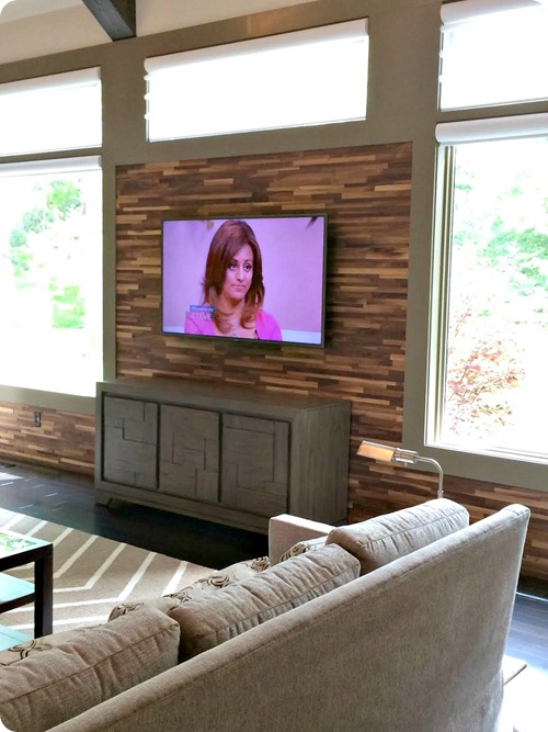
I knew the inside would match and I loved most of the interior design as well. The front living room had gorgeous wood beams, a beautiful wall treatment above the fireplace and a really cool wood wall behind the TV:
Reminded me of my wood wall. A little. :)
This kitchen was the only non-white one of the bunch:
The backsplash was a little busy for me but it was still lovely. (By the way, this house had utility rugs down everywhere to protect the floors so that’s what you see in a lot of these pics.)
The basement was HUGE and I loved this little alcove with the wood planked walls:
It tied in beautifully with the kitchenette/bar area.
As you can see there were a lot of well done wood accents in this home. The outdoor porch ceiling was divine:
The modern look carried through to the outdoor furniture as well.
The master bath floor was different – the two-tone design made a big impact:
I don’t think I could do this in my home but it was perfect in this one.
This wall of bubble tile behind the tub was AWESOME too:
I freaking love that bubble tile. A house at last year’s tour had it as well and it’s so fun!
I noticed the island in the closet had a lovely wood countertop, and then when I looked closer I realized it was one a DIYer could easily put together:
Even in these million dollar houses there were little touches that were attainable. :)
The next house was the most traditional from the outside:
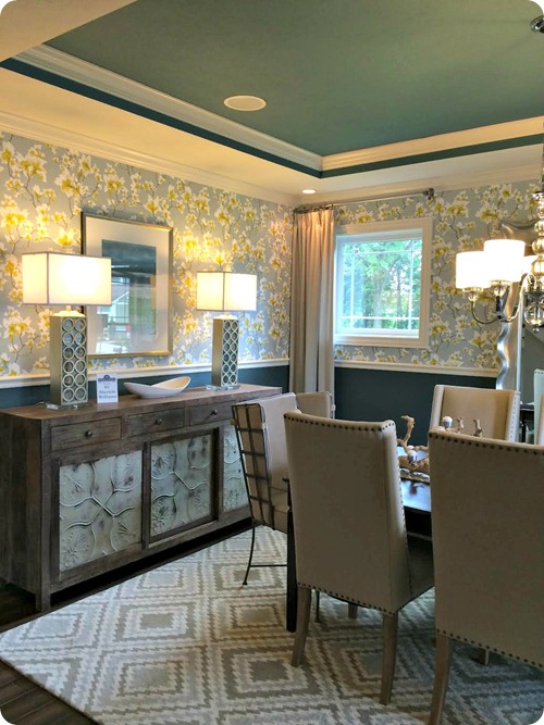
And definitely had the most color on the inside. The decorator mixed a lot of color and pattern throughout. The dining room was really stunning in person:
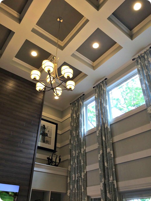
The two story family room was done full out – floor to ceiling drapes, tons of molding and a lot of patterns mixed together:
It was a bit much for me but really well done. Those two story rooms can be a major pain in the butt to decorate, and I love how they used molding to make more of a statement.
I just probably would have done one or two walls instead of all:
The coffered ceiling was stunning too:
The kitchen was traditional as well, with white cabinets and a brown and cream backsplash:
I loved the little touches like the transom over the pantry door. I love transoms and have considered adding some in our house.
The lights over the island were gorgeous:
And the outside patio was by far one of my favorites:
I’ve been eyeing those outdoor poufs at Target since March but can’t figure out where they would work in our house. ;)
I thought it was cool how they constructed a huge bench with pavers:
It was a fun element on the patio for sure.
This breakfast room right off the patio was one of my favorite rooms in the house:
Do you see the long window bench along the back? Just dreamy.
I loved how the designers used paint and painter’s tape creatively in this house. This design would take some time to get right but it makes a HUGE impact for very little money:
It’s hard to go wrong with a simple stripe – I loved the these two colors together in the basement family room:
And the basement bathroom had another simple and inexpensive stripe treatment:
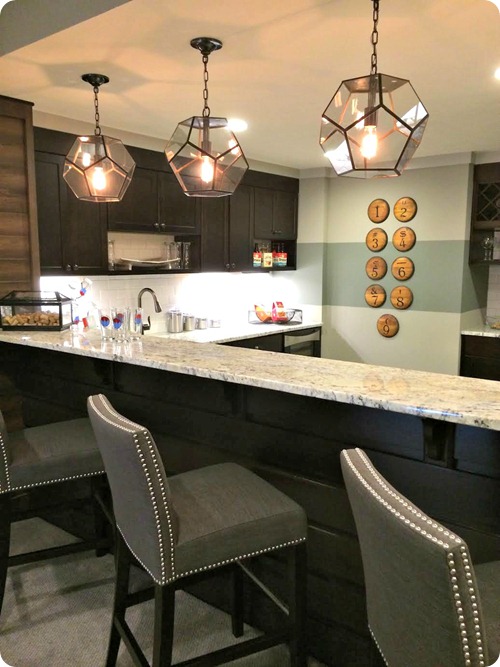
The bar/kitchenette in this basement was beautiful and you can see they pulled those colors and stripes through again:
Those lights! I love them.
I liked this birch wallpaper paired with the dark wood bench seating too:
Basements are FUN – you can take chances in a space like this!
One more simple idea I loved – this “art” in one of the kid’s rooms – it’s just molding, black paint and wood letters from the craft store:
You could do names or “eat” in a kitchen (with red letters, how fun!) – so easy and cheap!
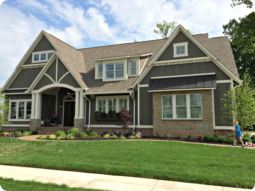
The last house was my second favorite – the outside was cottagey and adorable:
If you can call six thousand square feet “adorable.” Sure you can. :)
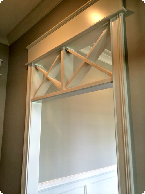
They did a cool transom in some of the doorways:
Lovely right? I thought that was a really cool detail.
This wallpaper in the powder room was deep and dramatic and I LOVED it:
Again, if you want to go bold a powder room is another great place to do it!
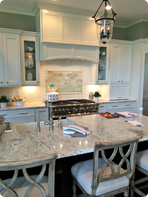
I thought the family room and kitchen matched the outside of the house perfectly. I love when a design carries from the outside in:
The detail on the mantel was just lovely.
I love the idea of using an expensive tile you love in a small dose above the stove:
It’s a great way to pull in some color – and a lot easier to change out later (compared to the entire backsplash) if your taste changes over time.
I loved how they put the area around a doorway to good use:
I think the detailed transom is a little much there – but I love taking advantage of space like that!
The backyard was another favorite – there were a couple levels and I loved the organic feel to everything:
When you walked up the stairs this outside room was open to a hearth room off the kitchen. All of it was SO beautiful:
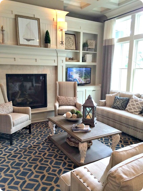
And when you walk through the hearth room you get a lovely view of the living room we already saw:
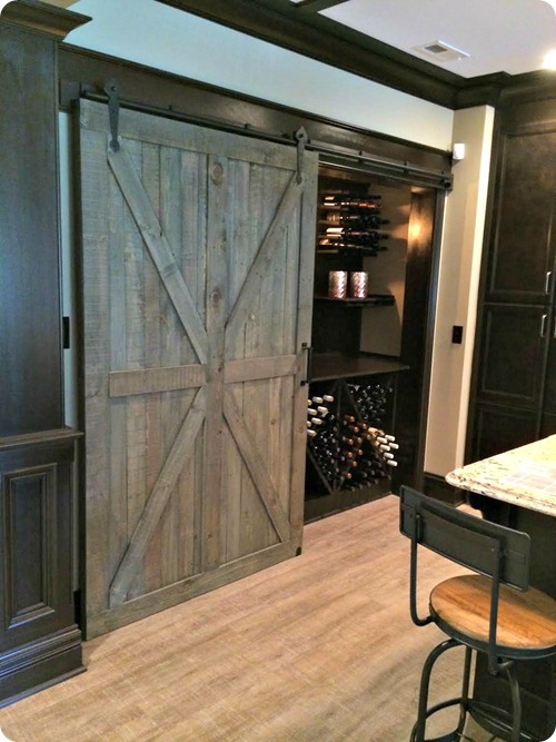
The basement was another beauty – I think there may have been a sliding barn door in every house! But this was my favorite one:
That’s some great wine storage too. :)
I noticed the floor and had to take a pic – they are the wood looking tile but I’ve never seen quite this finish before. It was like a distressed, linen-type look. I loved them:
I’ve seen the wood tiles before but I think I like these even more. They looked like real wood to me.
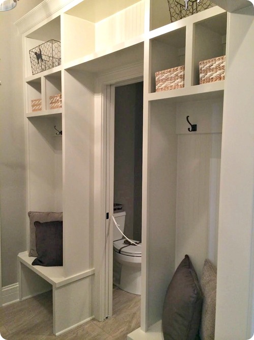
One last idea that I liked in this house – there wasn’t really a big, dedicated mud room space, so they created one with very little square footage:
Again, I loved the look of it wrapped around the doorway. Funny how you find great space-saving ideas in these huge houses!
Whew! That’s it for the tour! I believe it’s still going on this week, today through the weekend in Westfield, IN if you are interested in going. I’m a home addict and I loved walking through them. :)
**House one was designed and built by Hoss Homes and decorated by Kittles (Tom Myers). House two was designed and built by M/I Homes and decorated by Mary Cook and Associates. The final home was built by Heartwood Custom Homes and decorated by Everything Home LLC.













0 comments:
Post a Comment